A big day for the blog, perhaps. After spending a few hours downloading and exploring a few “free” photo-related WordPress themes, I plunked down a bit of cash (well, plastic) for Photocrati, from the same outfit that designs and markets the NextGen WordPress plugin. There’s no free lunch. This I should have learned many times over. Even in my advanced years, I keep having to relearn this notion.
The rest of the day, from early afternoon onwards, was spent poking around with Photocrati, learning some of its idiosyncracies, and fixing up existing (NextGen) galleries and (WordPress) pages to play nicely with the Photocrati theme. In the process I solved one vexing issue, namely how to kill that huge list of page-links in the header. The answer to that one was simple: there should only be a handful of top level pages. One of these should be called “Galleries.” All the individual gallery pages (Eg. Vermont 2011, AT-2002, etc.) should link to the “Galleries” page as parent. Again, duh. This is how the old TerrapinPhoto site was organized as well.
So, all the individual gallery (WordPress) pages were tweaked to point to that new parent, and now use NextGen “shortcode” to point to their respective (NextGen) image galleries. The NextGen image galleries also need to link back their respective Wordpress pages, else they will open up on the Galleries page, which isn’t what we want. Having done all that, the Galleries page now contains a single NextGen album which nicely links to the subsidiary gallery pages. Whew.
Well there’s still tons of work to do. For one thing, I need to experiment with optimal image sizes to balance out image size/resolution and acceptable page-loading times. Right now, the galleries with high-res images take a very long time to load. That’s not so much an issue for me, but it may scare off almost anyone else trying to browse the site.
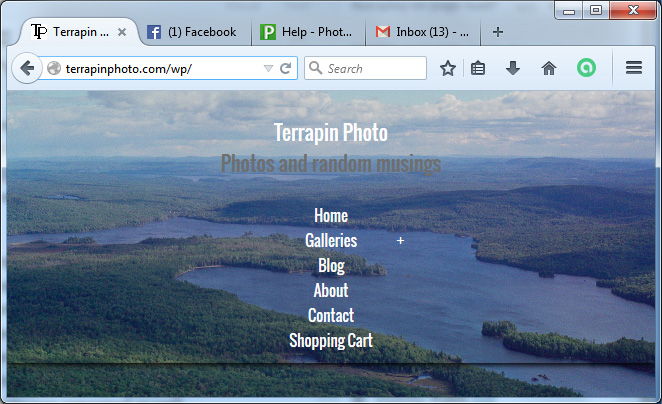
And then of course there’s a huge amount of tweaking left to do with the theme itself; Photocrati is more of a theme-builder than a single theme, and there are dozens if not hundreds of choices to make, some of which radically alter the look and feel of the site. Here’s how the homepage looks as of this moment. The background rotates between a small set of images. The homepage can look rather different on a larger screen – that’s another surprise (at least with Photocrati) that’s going to complicate the testing as I continue.
